What is a Bell Curve?
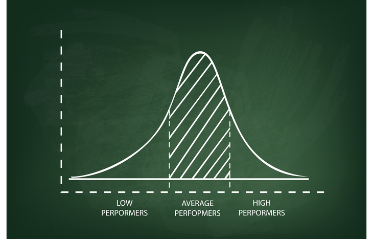
Anyone familiar with basic statistics is familiar with the concept of a bell curve. A bell curve is a visual representation of normal data distribution, in which the median represents the highest point on the curve, with all other percentiles skewing lower on both sides. The shape of this graph looks like a bell, hence the name.
Symmetrical bell curves are an important tool in finance and investing. At a glance, they show the mean, median and mode of a data set, along with the probability of data above or below that point. The width of the bell curve represents total range, to provide context for the data.
You don’t need to be a statistician to appreciate the information a bell curve offers, especially as an investor. A simple understanding of what one represents and the insights gleaned from it can fuel informed decision-making.

A Normal Distribution of Data
Bell curves represent normal probability distribution. The highest point of the curve (the middle) represents the most likely outcome. Everything to the left and right of the middle represents decreasing probability down to zero, at an exponential rate. Usually, they’re divided into standard deviations from the mean, representing different probability ranges. The further from the mean, the lower the probability:
- 68% of data points land within one standard deviation of the mean
- 95% of the data stays within two standard deviations of the mean
- 99.7% of all data within a range sits within three standard deviations
Here’s a look at a couple of simple examples of data you might find on a bell curve:
- Employee performance tends to fall on a bell curve. Adequate employees make up the mean, while underperforming employees skew down to the left and over performing employees skew down to the right.
- Investing risk-return analysis happens over a bell curve. Balanced risk and return represent the median, while overly conservative portfolios fall to the left and overly aggressive portfolios fall to the right.
While bell curves may not always present as perfectly symmetrical, they nevertheless represent normal distribution based on available data. Identifying the mean, median and mode, along with the standard deviations to both sides, allows investors to identify probabilities for positive return.
How to Read a Bell Curve
When analyzing something like risk-reward, investors need to know how to read the data. Say, for example:
- The median return for the Telecom Sector in a given year is 14%, represented by 62% of all companies in the sector.
- A standard deviation of -1/+1 might represent 12% and 16%, encompassing 76% of all companies.
- Further, deviation of -2/+2 might represent 10% and 18%, encompassing 95% of Telecom Sector companies.
In this example, investors can analyze the potential for profits across the Telecom sector by recognizing the distribution of data from the mean. For instance, there’s only a 5% chance of beating the sector average by 4% when handpicking stocks, an indicator that risk outweighs potential reward.
Bell Curve Applications in Investing
Investors can use bell curves to examine datasets in regard to a wide assortment of investing approaches. Risk-reward analysis is the biggest and broadest application, but the following practices also rely on assessment:
- Speculative traders use bell curves to assess future stock prices based on previously established support and resistance levels.
- Fundamental investors may plot a company’s potential for future earnings growth on a bell curve, as a way to understand probability thresholds for growth.
- How likely is a company to default on its debts or axe its dividend? Investors can model these probabilities for better risk analysis.
So long as the data represents a standard distribution, a bell curve is a powerful analytical tool for investors. If the data doesn’t represent a standard distribution, investors risk misinterpreting probabilities.
Limitations of Bell Curve Representations
As mentioned, these statistical representations aren’t always symmetrical. Some can have long tails, for example, which actually skew probability. While the curve itself still represents normal distribution, the statistical outcomes outside of the norm are actually higher, called “excess kurtosis.”
Another limitation of bell curves is the pervasiveness of “grouping.” Bell curves plot data based on static datasets or constants, when in reality, data is dynamic. As a result, some points may move between standard deviations depending on when the data was taken. Reconstituting the bell curve can change the skew of the data and the value of each standard deviation.
Finally, relying too heavily on a bell curve for probabilities can result in skewed decision-making. Markets can behave irrationally, outside of statistical probability. Use a bell curve as a theoretical tool; not a hard-and-fast benchmark for probability.
A Quantitative Tool to Measure Risk
Ultimately, a bell curve is a visual, statistical representation of risk. By showing investors the mean, median and mode, as well as the range and statistical standard deviation, it’s possible to assess risk and reward at a glance. And, for applications like portfolio distribution analysis, it’s easier to understand how different asset allocations will fare in given market conditions.
When assessing a bell curve, make sure to also factor in the context. Is it a normal distribution of data? Is the data relevant and timely? What’s the context for each standard deviation outside of its representation? The ability to apply bell curve insights to investing analysis gives investors a powerful edge in setting expectations for their decision-making.


