
Top 20 Stock Chart Patterns for Traders and Investors
Stock chart patterns can be a vital tool for investors. They provide an exceptionally detailed level of a stock’s trend lines. This can give a major leg up against the competition. This is why they are used by the likes of retail investors, billion-dollar hedge funds and everyone in between.

Basically, stock chart patterns are a way to view the ups and downs of a stock’s price over the course of time… and then use that information to help predict future movement. They can be a micro-analysis of a single day’s worth of trading. Or they can offer a long-term view of a stock’s performance over the course of several years.
Stock chart patterns tend to repeat themselves over and over again. So when investor’s see them forming, they can get a better idea of which direction a stock’s price may be heading.
This can be incredibly handy information to have for investors of any kind. Short sellers can use patterns to predict when an asset is about to drop in value. Momentum investors can use it to figure out when the price is heading upward. And options traders can lean on this information to make short-term profits.
While it’s hard to overestimate the value of stock chart patterns, they can be difficult to spot for the untrained eye. That’s why we’ve put together this simple list of the most helpful stock chart patterns used today.
The 20 Most Useful Stock Chart Patterns:
Ascending Triangles
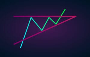
The ascending triangles a is favorite among those looking to take a bullish stance on an investment heading upward. When those first two triangles form after reaching similar high-price points, it signifies that a breakout is likely.
To identify this stock chart pattern, place a horizontal line at the price peaks. This is known as the resistance line. Once the resistance point is identified, place an ascending line (the line signifying an upward trend) along the support points. When accurately identified, this is one of the stock chart patterns that suggests a breakout price that will surpass the previous two highs.
Bearish and Bullish Symmetric Triangles
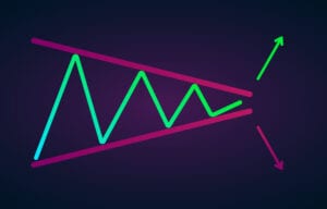
Symmetric triangles consist of two trend lines that bounce up and down in price while coming closer together. And this is one of the easiest stock chart patterns to spot. When the triangles start to converge, this can signify a breakout in either direction.
As you can clearly see above, the support line is drawn along the upward trend. And the resistance line is drawn along the downward trend. The important thing to know is that the sharp movement in price can happen in either direction. But it most often follows the general trend of the market.
Bollinger Bands

Bollinger Bands are a more complex statistical type of stock chart pattern. John Bollinger developed this technique in the 1980s. It consists of two trading bands above and below a stock’s moving average.
This type of chart can help determine whether an asset’s price is high or low on a relative basis. These chart overlay bands use both the moving average and past volatility. To determine how far apart the bands are, this technical analysis tool uses standard deviation.
When the stock’s price is consistently hitting the upper side of the Bollinger Band, the asset is considered to be overbought. That means it could be headed toward a downtrend and it’s time to sell. And when the lower band is the constant touchpoint, that signals that it could be oversold… meaning that it can be purchased at a discount.
Bump and Run
This formation is much rarer. But when it’s spotted, its picture can be worth a thousand words… or dollars. And it can be incredibly useful for finding short-term trends and predicting their demise.
Compared with other stock chart patterns, this one is used more often for longer time frames. Think of the course of a couple of months instead of days. But there can be exceptions to that, of course.
The setup is similar to an ascending triangle. But this time there are three high prices along the ascending line. But the fourth ascension is a doozey. That’s the bump part of the chart. But once the new high is hit, it’s time to run (or sell). Because according to the chart, the stock price is in for a major pullback.
Cup and Handle
The cup and handle pattern is one of the more well-known signals of a bullish trend. But it can be difficult to identify far in advance. This is why many investors look out for stocks with a price point nearing the top of the handle. That signals a potential breakout in price.
As you can see above, the low-price points form the rounded-out bottom of the cup. As the low prices become tighter and less deep, they form the handle. And once the handle is complete, that sends a strong signal that it’s time to buy.
Some folks keep their coffee cups upside-down in their cabinets. And that may be worthwhile in order to train your eye how to spot an inverse cup and handle pattern. Because if you flip this pattern upside down, it can be an indicator of bad things to come. If anything in your portfolio begins to look like an upside-down cup and handle, it could be time to sell.
Descending Triangle
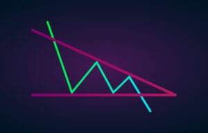
This one sends the opposite signal of ascending triangles. The descending triangles suggest a bearish forecast. In this case, it’s the support line that’s horizontal. And the resistance line is pushing downward. This suggests a good chance that the stock’s price is heading toward a major decline.
Double Bottom
This one doesn’t require much in the way of illustration. If you can picture the letter “W,” you can identify the double bottom. Its major elements are indicated when a stock’s price has made two futile attempts to break upward near the same point. But after the first two unsuccessful attempts, upon hitting the support level, resistance fades and the market price breaks out for a big upward trend.
Double Top
Once again, there’s not much needed in the way of visualization. This is the opposite to a double bottom. So naturally, it looks like the letter “M.” But this one signals a bearish trend, one that indicates the price will fall below the support line. When this one’s spotted, it’s time to sell.
Bearish and Bullish Flag
Like many of the others stock chart patterns, the flag pattern also comes in two varieties: bearish and bullish. And it can take a little imagination to picture or find.
The hallmark of the flag pattern is that over a short period of time, a stock’s price chart appears to look like a flag on a flagpole. In a bullish flag, there is a rapid increase in price. This is represented as the flagpole. Once the upward momentum pauses, the price fluctuates in a tighter channel over a period of time. This can be caused by a decrease in trading volume. This appears as the flag on the pole. But that upward momentum can be picked up on by a new set of investors and traders. And if trading volume during the consolidated price moves begins to pick up, this is indicative of a forthcoming price spike. And that is an example of a bullish flag pattern.
In the case of a bearish flag pattern, it is the exact opposite. A rapid downward trend in price is followed by tighter price fluctuations. In a bearish flag pattern, trading volume doesn’t always decline during the tightened channel, though. But as fear over potential price drops increases and trading volume increases, it can cause a significant price drop.
Head and Shoulders

The head and shoulders stock chart pattern can predict a price reversal. It is noted for its large peak flanked by two smaller peaks on either side. The important distinction is that all three spikes retreat to the same support level. After the third price spike (or right shoulder), this chart suggests the price is likely to break downward. This is a strong indicator that it’s time to sell.
Inverse Head and Shoulders
Take a look at the chart above. Now flip it upside down. The inverse head and shoulders stock chart pattern is used as a predictor for good things to come. Once the third drop in price is hit, it can be a sign that a stock’s price is about to rapidly shoot upward past the two previous highs. You can also refer to this pattern as a “reverse head and shoulders” or a “head and shoulders bottom.”
Bearish and Bullish Pennant
This stock chart pattern is similar to a flag pattern. The bullish variety is formed by strong upward movement followed by a tighter fluctuation in price. This happens when there is a lot of bullish interest in the stock (pushing the value up), which is followed by a cooling off period. But if volume begins to pick back up, it can be an indicator that the momentum that carried the stock’s price upward is about to pick back up. And therefore, the stock price is about to shoot upward.
The pennant pattern works both ways though. If a stock’s price falls rapidly and is followed by a leveling-off, this can be a good indicator that the stock’s price will continue to decline. In other words, it’s time to sell.
Pennants are represented by two lines that meet at a set point. They are often formed after strong upward or downward moves where traders pause and the price consolidates before the trend continues in the same direction.
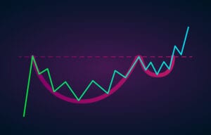
Rounding Bottom
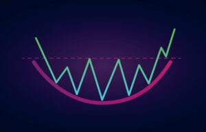
Not all cups have handles. As you can see above, as a stock’s price support line grows closer to the resistance line, it can indicate that a serious upward trend is on the horizon. In this case, anyone who buys near the middle of the “U” shape should be in for a boon to their portfolio. As soon as it breaks through the resistance level, this pattern indicates a bullish future. And even if it doesn’t break through right away, it can still fall into the cup and handle pattern, which is just as positive. It just might take a little longer to reap the rewards.
Rounding Top
If any holdings in your portfolio begin to follow price fluctuations looking like an upside-down cup, that could be a big warning signal. If volatility is mild, then increases and goes mild again, but resistance at the top isn’t broken, a stock’s price could be getting ready for a big downward ride. In this case, it’s either time to sell or time to buy put options.
Falling and Rising Wedge
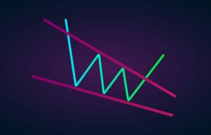
This stock chart pattern is quite similar to the triangle patterns mentioned above. Like the triangles, it forms by tightening price movements between the support and resistance lines. But in this case, neither the support or resistance line is horizontal. So, if the lines are in a downward trajectory as the price fluctuation decreases (as seen above), it can mean that the price is about to break out. This is an example of a falling wedge.
On the other hand, if the support and resistance lines appear to be heading upward, this wedge can represent a potential downward price trajectory. That would be an example of a rising wedge.
The Bottom Line on Stock Chart Patterns
These 20 stock chart patterns are just some of the most popular. The truth is there are scores of other charts analysts use to find price patterns to capitalize on. But they can be hard to spot and even harder to take advantage of. So be careful when trying to identify them. And it’s also worth mentioning that they are far from a “sure thing.” If stock patterns were always a crystal ball for the future, we’d all be much more adept at identifying them.
About Matthew Makowski
Matthew Makowski is a senior research analyst and writer at Investment U. He has been studying and writing about the markets for 20 years. Equally comfortable identifying value stocks as he is discounts in the crypto markets, Matthew began mining Bitcoin in 2011 and has since honed his focus on the cryptocurrency markets as a whole. He is a graduate of Rutgers University and lives in Colorado with his dogs Dorito and Pretzel.