
What is a Candlestick Chart?
When you want to know how a stock has performed over a certain period of time, one of the quickest ways to gauge its behavior is to look at a stock chart. And while there are several types of visual charts to choose from, a candlestick chart is undoubtedly the most useful. At a glance, investors can see pricing action, stock behavior and investor sentiment, all contextualized in an easy-to-read chart.
Candlestick charts have been around in some form or another since the 1700s, and they’re the de-facto tool of modern-day pattern traders. They’re incredibly useful for seeing trends, patterns and oddities in stock price performance. Learning how to read and interpret a candlestick chart is an invaluable skill, no matter what type of investor you are.
Here’s everything you need to know about candlestick charts, including a breakdown of each candle, how to recognize patterns and how to factor this information into investment strategies and decision-making.
Understanding Candlestick Components
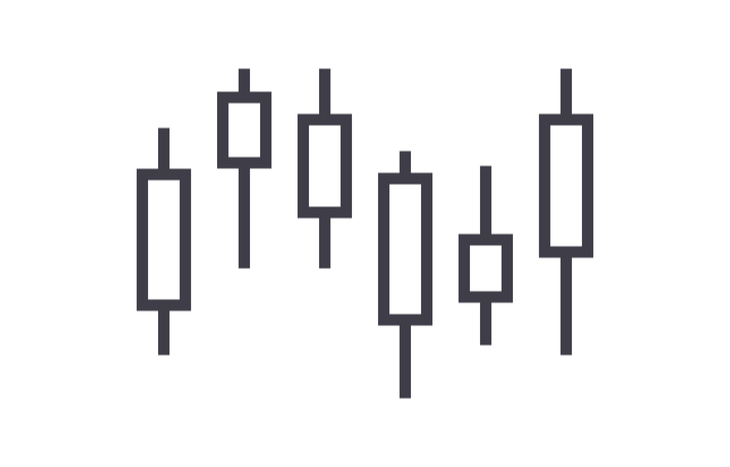
Every trading period represented on a candlestick chart has its own candle. Candles offer a complete depiction of how the stock’s price behaved on a particular trading day. There are three features to each candle:
- Wicks. The lines coming off the top and bottom of each candle are its wicks. They represent the price highs and lows reached during the trading period. The longer the wicks, the more volatile the pricing action on a given day.
- Bodies. The “real body” of the candle represents the difference between the open and closing prices. The longer the body, the greater the rise or fall of the stock’s price from its open to its close on a specific day.
- Shading. The body of a candle can either be white or black. A white candle means the price went up during the trading period. A black candle means the price went down. Some charts contextualize this in green and red, respectively.
Using these elements, investors can quickly identify how a stock behaved on any single day within a trading period. For instance, a long white candle with very short wicks means that the price went up with very little volatility that day. Conversely, a short black candle with long wicks would signify a rollercoaster stock that ultimately fell a little in price.
Spend enough time looking at a candlestick chart and reading individual candles will become second-nature. Then, it’s a matter of putting together this information to glean insight about a stock’s behavior over a broader period.
How to Read a Candlestick Chart
When looking at a candlestick chart, investors need to consider two layers of data. First, the data represented by each individual candle. Second, the larger depiction of trends over many trading periods.
Because each candle on a candlestick chart shows four distinct price points, it provides encompassing detail for a trading period. Investors can see the price highs and lows, as well as the open and close. Moreover, the color of the candle shows price movement at a glance. All this information informs what happened during a specific trading period.
Over several periods, individual candles come together to contextualize trends. Looking at the color and length of candles, investors can gauge the severity of price movements or the momentum of investor sentiment. This broader context can inform hypotheses about how the stock will perform in future trading periods.
When assessing a candlestick chart, most investors are looking for patterns. Homma Munehisa, inventor of the candlestick chart, realized that by charting price and investor behavior within the context of that price, it’s possible to predict future behaviors. This is the fundamental hypothesis for technical trading, which relies heavily on candlestick chart pattern identification.
Common Candlestick Patterns
There are numerous types of candlestick patterns that can manifest on a chart. At the highest level, they fall into one of two categories: bullish and bearish.
- Bullish patterns show generally rising prices over a period. They typically signal strong investor sentiment and confidence in a stock, leading to price appreciation.
- Bearish patterns show generally falling prices over a period. These trends signal poor investor sentiment and a lack of confidence, which causes the price to drop.
Within both of these broad families exists a multitude of specific patterns that provide context for investor hypotheses. Some of the most common include:
- Engulfing patterns depict a short candle that’s completely overtaken by a longer candle in the following trading period. Engulfing patterns can be bullish or bearish, typically signaling price reversal.
- Evening star patterns show a small candle at the peak of a trend, followed by a reversal in the next candle. The small candle is above the ones before and after it, which gives it the appearance of a star.
- Harami patterns show a small candle that’s completely contained within the body of the prior period’s candle. Harami patterns can be bearish or bullish, signaling an impending price reversal.
- Three-candle patterns are as the name implies: three candles in a row that trend upward or downward at the same relative pace. They’re usually bookended by two long candles in the opposite direction.
The more familiar you are with candles and candlestick charts as a whole, the more apparent these trends will become. They can also factor into even larger charting patterns, providing buy/sell signals for investors.
Get Familiar With Candlestick Charts
Charts are an integral part of investing and provide the context required to understand a stock’s behavior over time. Candlestick charts take it a step further, packing in a huge amount of price context to show why a stock performed as it did on a given trading day or over a period. For investors new and experienced alike, candlestick charts are an invaluable tool in analysis and decision-making.